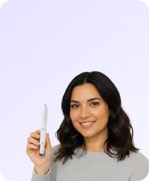
Design System

Defined and flexible core structure we would be using all over the site

Page Wrapper


Page Wrapper
Container Small
Container Medium
Container Large
Padding Global
Padding Section Small
Padding Section Medium
Padding Section Large
Button Group

Headings

HTML tags define default Heading styles. Use Heading classes when the typography style doesn't match the default HTML tag.

H1

Sample text helps you understand how real text may look. Sample text is being used as a placeholder.

H2

Sample text is being used as a placeholder. Sample text helps you understand how real text may look.

H3

Sample text helps you understand how real text may look on your website. Sample text is being used as a placeholder for real text that is normally present.

H4

Sample text is being used as a placeholder. Sample text helps you understand how real text may look. Sample text is being used as a placeholder for real text that is normally present.

H5
Sample text is being used as a placeholder. Sample text helps you understand how real text may look. Sample text is being used as a placeholder for real text that is normally present. Sample text helps you understand how real text may look.
H6
Sample text is being used as a placeholder for real text that is normally present. Sample text helps you understand how real text may look. Sample text is being used as a placeholder for real text that is normally present. Sample text helps you understand how real text may look.

Other HTML Tags

HTML tags define default text styles.

All Paragraphs

Sample text is being used as a placeholder for real text that is normally present. Sample text helps you understand how real text may look on your website. Sample text is being used as a placeholder for real text.

All Links
All Links
All Quotes
Sample text is being used as a placeholder for real text that is normally present. Sample text helps you understand how real text may look on your website.
All Ordered Lists
  1. Sample text is being used as a placeholder for real text that is normally present.
  2. Sample text is being used as a placeholder for real text that is normally present.
  3. Sample text is being used as a placeholder for real text that is normally present.
All Unordered Lists
  • Sample text is being used as a placeholder for real text that is normally present.
  • Sample text is being used as a placeholder for real text that is normally present.
  • Sample text is being used as a placeholder for real text that is normally present.

Text Classes

Text classes when typography style doesn't match the default HTML tag.

Text Sizes

Text Size Large

Sample text is being used as a placeholder for real text that is normally present.

Text Size Medium

Sample text is being used as a placeholder for real text that is normally present on your website.

Text Size Regular

Sample text is being used as a placeholder for real text that is normally present. Sample text helps you understand how real text may look on your website.

Text Size Small

Sample text is being used as a placeholder for real text that is normally present on your website. Sample text helps you understand how real text may look on your website.

Text Size Tiny

Sample text is being used as a placeholder for real text that is normally present on your website. Sample text helps you understand how real text may look on your website.

Text Styles

Text Style Strikethrough

text-style-strikethrough

Text Style Italic

text-style-italic

Text Style Muted

text-style-muted

Text Style All Caps

text-style-allcaps

Text Style No Wrap

text-style-nowrap

Text Style Link
Text Style Quote

Sample text is being used as a placeholder.

Text Style 2 Lines
This CSS style is not supported for Rich Texts on iOS.

Sample text is being used as a placeholder for real text that is normally present. Sample text helps you understand how real text may look on your website. Sample text is being used as a placeholder for real text text-style-2lines

Text Style 3 Lines
This CSS style is not supported for Rich Texts on iOS.

Sample text is being used as a placeholder for real text that is normally present. Sample text helps you understand how real text may look on your website. Sample text is being used as a placeholder for real text. Sample text is being used as a placeholder for real text that is normally present. Sample text helps you understand how real text may look on your website. Sample text is being used as a placeholder for real text.

Text Weights

Text Weight X Bold
text-weight-xbold
Text Weight Bold
text-weight-bold
Text Weight SemiBold
text-weight-semibold
Text Weight Medium
text-weight-medium
Text Weight Normal
text-weight-normal
Text Weight Light
text-weight-light

Text Alignments

Text Align Left
text-align-left
Text Align Center
text-align-center
Text Align Right
text-align-right

Buttons

Button combo class system.

Button Primary
primary
Button Secondary
secondary
Button Tertiary
tertiary
Dark Button
primary
Transparent Button
transparent
Button With Icon
Button Primary (Large)
primary
Button Secondary (Large)
secondary
Button Tertiary (Large)
tertiary
Dark Button (Large)
primary
Transparent Button (Large)
transparent
Button With Icon (Large)

Pills

Pills components with variants

Primary Pill
primary
Secondary Pill
secondary
Tertiary Pill
tertiary
Dark Pill
dark
Transparent Pill
transparent
Pill With Icon
Primary Pill (Large)
primary-lg
Secondary Pill (Large)
secondary-lg
Tertiary Pill (Large)
tertiary-lg
Dark Pill (Large)
dark-lg
Transparent Pill (Large)
transparent-lg
Pill With Icon (Large)

Tags

Tag components with variants

Primary Tag
primary
Secondary Tag
secondary
Tertiary Tag
tertiary
Dark Pill
dark
Transparent Pill
transparent
Pill With Icon
Primary Pill (Large)
This is the default text value
Secondary Pill (Large)
This is the default text value
Tertiary Pill (Large)
This is the default text value
Dark Pill (Large)
This is the default text value
Transparent Pill (Large)
This is the default text value
Pill With Icon (Large)

Colors

Manage recurring text and background colors.

Text Colors

Text Color Primary
text-color-primary
Text Color Secondary
text-color-secondary
Text Color Alternate
text-color-alternate

Background Colors

Background Color Primary
Background Color Secondary
Background Color Tertiary
Background Color Alternate

Max widths

Use the max-width CSS property to contain inner content to a maximum width.

Max Width Full
Max Width Full Tablet
Max Width Full Mobile portrait
Max Width Full Mobile Landscape
Max Width xx Large
Max Width x Large
Max Width Large
Max Width Medium
Max Width Small
Max Width x Small
Max Width xx Small

Paddings

Utility spacing system - padding classes. [padding-direction] + [padding-size].

Direction Classes

Padding Bottom
Padding Top
Padding Vertical
Padding Horizontal
Padding Left
Padding Right

Size Classes

Padding 0
Padding Tiny
Padding xx Small
Padding x Small
Padding Small
Padding Medium
Padding Large
Padding x Large
Padding xx Large
Padding Huge
Padding x Huge
Padding xx Huge
Padding Custom 1
Padding Custom 2
Padding Custom 3

Margins

Utility spacing system - padding classes. [margin-direction] + [margin-size].

Direction Classes

Margin Bottom
Margin Top
Margin Vertical
Margin Horizontal
Margin Left
Margin Right

Size Classes

Margin 0
Margin Tiny
Margin xx Small
Margin x Small
Margin Small
Margin Medium
Margin Large
Margin x Large
Margin xx Large
Margin Huge
Margin x Huge
Margin xx Huge
Margin Custom 1
Margin Custom 2
Margin Custom 3

Spacers

Unified spacer system for the project.

Spacer Tiny
Spacer xx Small
Spacer x Small
Spacer Small
Spacer Medium
Spacer Large
Spacer x Large
Spacer xx Large
Spacer Huge
Spacer x Huge
Spacer xx Huge

Icons

Unify icons sizes. icon-height sets height of icons. icon-1x1 sets both height and width of icons.

Icon Height Small
Icon Height Medium
Icon Height Large
Icon 1x1 Small
Icon 1x1 Medium
Icon 1x1 Large

Useful utility systems

Utility classes we like to use in most of our projects to build faster.

Hide
This element is hidden
Hide Tablet
Hide Mobile Portrait
Hide Mobile Landscape
Overflow Visible
Overflow Hidden
Overflow Auto
Overflow Scroll
Pointer Events Auto
Pointer events none
Layer
Spacing Clean
Align Center
Z Index 1
Z Index 2
Inherit Color
Aspect Ratio Square
Aspect Ratio Portrait
Aspect Ratio Landscape
Aspect Ratio Widescreen

Webflow elements

Native Webflow elements with Client-First classes applied.

Form Components

Example of a form component using Folders

button
Thank you! Your submission has been received!
Oops! Something went wrong while submitting the form.
Text Rich Text

Heading 1

Heading 2

Heading 3

Heading 4

Heading 5
Heading 6

Sample text with a link is being used as a placeholder for real text that is normally present. Sample text helps you understand how real text may look on your website. Sample text is being used as a placeholder for real text. Sample text is being used as a placeholder for real text. Sample text is being used as a placeholder for real text.

  • Sample text is being used as a placeholder for real text that is normally present.
  • Sample text is being used as a placeholder for real text that is normally present.
  • Sample text is being used as a placeholder for real text that is normally present.
  1. Sample text is being used as a placeholder for real text that is normally present.
  2. Sample text is being used as a placeholder for real text that is normally present.
  3. Sample text is being used as a placeholder for real text that is normally present.
Sample text is being used as a placeholder for real text that is normally present. Sample text helps you understand how real text may look on your website. Sample text is being used as a placeholder for real text that is normally present.